Friday, August 17, 2012

The Making of Maps

Illustrated Map of Coney Island. gouache, watercolor, and acrylic 

 This is piece was actually created for a map designing contest. I decided to pick one of my favorite places to make a map of, Coney Island, where cheesy good fun is endless (and so is the funnel cake). While its more of an illustration than a map you can still tell (hopefully) where things are.


  Let me tell you one thing, illustrated map making, or at least like this, is really really really hard. Because there's so many elements I wanted to fit in, well its Coney Island it awesome and you really must include all the awesomeness that you can, I had to make individual little drawings of all the different attractions on tracing paper and keep moving things around to make everything fit before I traced everything onto the final piece of paper that I worked on. The planning out the entire map was the biggest time drain in the world. But the finished product is a pretty cool illustrated map. I'd love to make some more maps like this, preferably on a larger scale. Below are some of the individual sketches that I had to piece together in order to make the map.


Wednesday, August 15, 2012

Stormy Skies


 Since I caught a terrible cold (in August,just my luck right?) , I decided to work on improving an old project. So I just painted the skyline and installed the lighting in the skyline.

Next I'm going to be adding additional elements and then fitting it into a box.

It also happens to look pretty cool in complete darkness. (below) However it does look like the city is on fire at least in this picture. I really must get a better digital camera.

Thursday, July 19, 2012

Tea Party! (not the political party)


This is my next idea for a window display. I was staring at my mother's teapots when I got the idea to use larger than life teapots and cups to display scarves as the tea coming from the spout.  My mom has all these teapots and cute little teacups, it makes me always want to have a little tea party and have crumpets and muffins and dress up like Alice in wonderland... but I digress. I was thinking for the background to use paper doilies, cheap and easy, yet instantly makes you think of a tea party. And not the political party, they've just ruined the whole meaning of tea party. Till next time, have some tea and crumpets.  

Monday, July 9, 2012

Snake Snatcher!


At last, here is the final product of 3 weeks worth of work.  The story is she's a bad ass warrior getting taken into the mouth of a cobra, by it's tongue.  The entire window opening is basically the snake's mouth.
The head of that snake is what took us the longest amount of time, and it was mainly just problem solving. We tried creating it several different ways, until we decided to create it by using all the methods. Foam was carved, metal foil was sculpted, and painted glass ornaments finished the details for the head of the snake and voila! A snake head!  

Some tools and foam materials used in creating the head. 


    The base of the snake head is actually made of that pink foam (photo left) and was carved from that menagerie of saws and tools.


Model and sketch for final display.


There were 3 steps we took. The first creating the     model and sketch for the window. 


Then of course creating the snake head, which we put aside until we installed the armature for the rest of  the structure and covered it. 

Armature for the sides of the snake.


 The final step was surprisingly tricky, light it. I burnt my fingers more than a few times. 

Tuesday, May 1, 2012

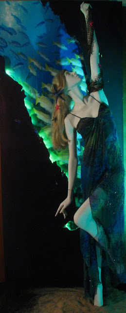
What Lies Beneath the Water

Display with the blue light behind it

   This is the latest window display I designed and put together with my partner.  The styling I had a blast with. My mom and I are very into collecting seashells and really anything that has to do with the ocean. This gave me a ton of different styling props to play around with. The big blue starfish in her hair actually is from our trip to the US Virgin Islands a couple of years ago. Her dress, a Sue Wong fully beaded gown, I picked up from Loehmann's for my prom dress a couple of years ago. The dress print itself was inspired by coral and underwater. I thought what better than to display the gown as if she was underwater and reaching up onto a fishing net adorned with more starfish. The story I had in my mind for this window was she was in an underwater cave, catching the net and rising to the surface in this gorgeous gown of course. We put lights behind the silhouette of the cave and they changed colors so we have more than one shot of it.

 
Display with a green light behind it 

     The window display I'm currently working on is a mannequin walking into a gigantic snake's mouth. dun, dun, DUN! No I swear its not that scary, we're trying to go for a more a seductive look with it.

   PS. Not a big fan of carving foam, I end up every night with pink foam and glitter all over my clothes,   looks like I got some magical dust from a fairy thrown onto me.

Carving the snake head out of foam for the facade of the window display


Friday, April 6, 2012

Summertime Dreamin'


Here's my latest sketch, I was wishing that summer was already upon us. I've personally been looking for a retro style bikini for the last couple of months and simply can't find one, so I drew a child version of what I wanted for a bikini. If you can't get it, might as well draw it. I also went to Ben and Jerry's free cone day, it helped me ease the pain of not finding the bikini. Its so true about art and life merging, all in one sketch the bikini that I wished I had and the ice cream I actually did get. Haha, well I'll find that suit before summer! Its my goal except for perhaps getting some more artwork done.

Saturday, March 24, 2012

Character Study!

So this is another character study of Molly, of In My Mother's Closet.  This one is in gouache, I've never done an image entirely in gouache and I really love the flat quality. It feels very solid. I did another one in watercolor that just didn't feel right and the previous Molly face in just some quick washes which I liked. 

Gouache turns out to be a medium I really like. The problem is if you want flat solid color you have to mix it prior and then fill it in and make sure you don't overlap with another color otherwise it will mix with the other color. Hence there is no painting over gouache, but that is only a small con for me. It is still much easier than watercolor which is very unforgiving.  Anyways, I think I will try doing an entire piece in gouache this time and post later.